UX/UI
The following designs were assignments for a class on UX/UI design. We were given prompts, and asked to redesign or design web pages like a 404 page, or About Me page.
Boarding Pass
For this week’s UI challenge, I decided to focus on condensing all resources one might need to access while at the airport into one. This boarding pass is highly interactive and easy to use.

404 Page
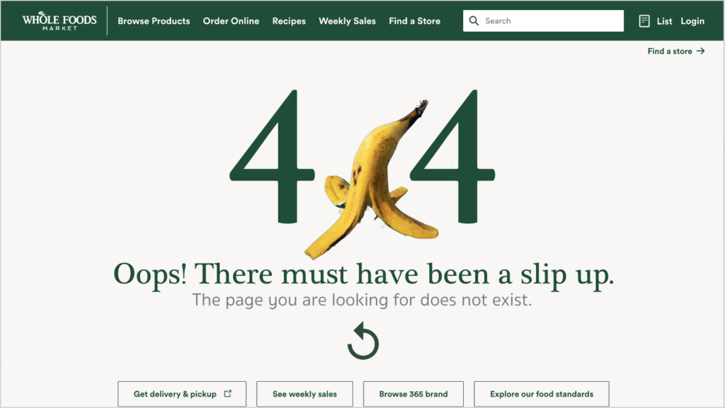
For our second UI challenge, I chose WholeFoods as the website I would focus on. The 404 page below aims to add a little bit of humor to the commonly boring error page, while sticking with the WholeFoods brand.
Netflix
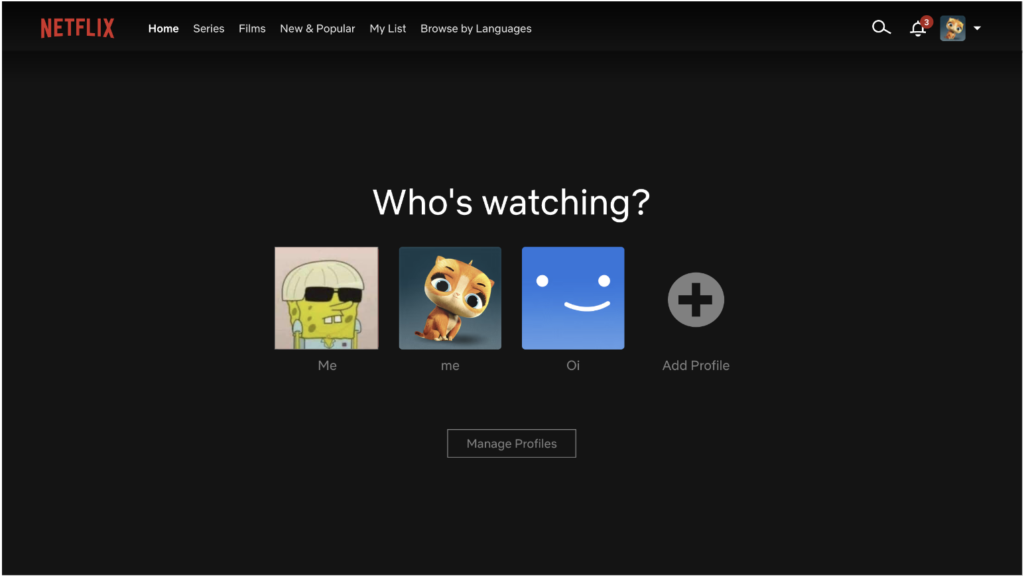
For this week’s UI, I decided to make the process of choosing what to watch on Netflix a bit more interactive. By adding several steps (with the option to also just browse through), users can receive help in choosing what to watch.
About us
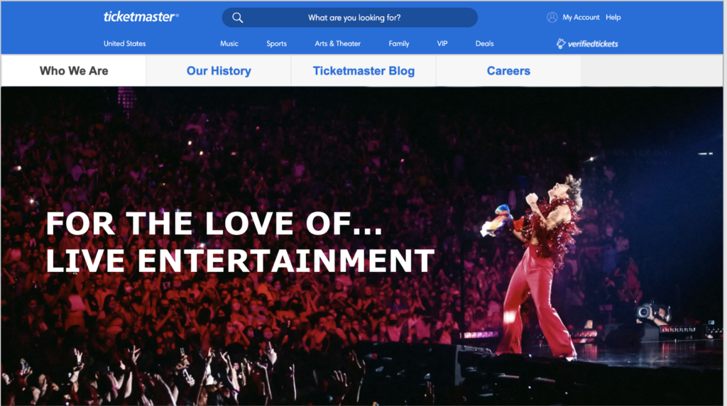
I decided to reinvent the TicketMaster About us section into something more interactive. My vision is that the entire website would be a scroll through graphic, with images that were a better representation of actual Ticketmaster events
Bagel Delivery Service
I decided to make my bagel delivery service very modern, and easy to use. I designed it with inspiration from the popular food delivery service app, Postmates, because users of Sophia’s demographic would be likely to use a service to one they regularly use.
Web Design
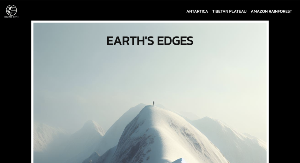
Earth’s Edges
This webpage was created for a class project where we were given a prompt, and had to create a multi-page website on it using the help of artificial intelligence. This website was created using HTML/CSS and then uploaded to WordPress.
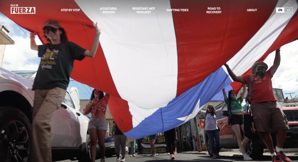
Isla de Fuerza
Isla de Fuerza was a multimedia project by the Hussman School of Journalism and Media’s MEJO 584 class. Our team consisted of talented student videographers and photographers, reporters, faculty members, and web designers and developers, like myself.
As a class we were dedicated to amplifying the voices of Puerto Ricans and sharing their stories of strength and hope through our project. A previous group of students in this class reported on the aftermath of Hurricane Maria in 2018, and we returned with the aim to continue learning about the culture and people of the island.